Libby Case Study
a shameless redesignProject
- UX Research
- UI Redesign
- Figma
Deliverables
- Homescreen Redesign
- LoFi Wireframes
- HiFi Wireframes
- Prototype
Roles
- UX Researcher
- 3 interviews
- Competitor analysis
- Google Play/Apple App reviews
Roles
- UI Designer
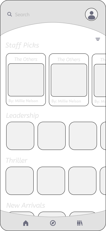
- Wireframes
- LoFi Screens
- HiFi Screens
Project Info
Challenge
Libby is an app designed by Overdrive. Finally, there’s a digital solution for libraries that takes a user centered approach. Many library apps are under-funded or clunky in design. You can tell Libby was created with ease of use in mind.
Unfortunately while there are a lot of benefits to Libby, there are still quite a few complaints from users. A quick search through the ratings showed that people were still disappointed by the busy UI and the laggy design.
Solution
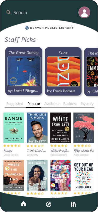
After taking a look at the most common complaints, I aimed to make the home screen a little more clean and easier to navigate.
The home screen currently has a lot of random suggestions and lots of information that doesn’t add value. It’s hard to tell what they are suggesting, and it seems to scroll on forever. It becomes overwhelming for the user.
I kept the search bar fixed to the top of the screen and made the sections clearer by labeling and categorizing them with a top tab swipe navigation.
It’s poorly organized, and looks like garbage compared to the Overdrive app I used to use. It’s not well laid out, the colors and “cutesy” graphics are ugly, and I miss having a UI experience that made sense.
The user interface in this app is difficult to use and not intuitive. Some navigation buttons are at the top and some are at the bottom. The main screen has no option to search for a book and it is not clear how to do so.
UX PRocess
This is not working
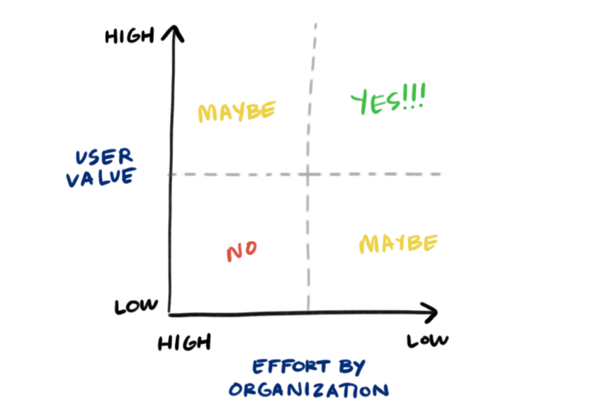
My first step was prioritizing what was most important and what was most achievable. I settled on working to fix the home screen first, as it seemed the most common problem in user reviews.
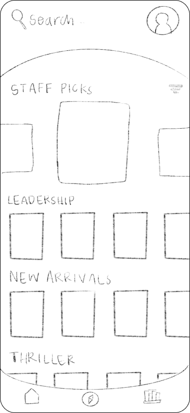
Then I went ahead to sketching out possible solutions. Isolating specific user complaints, I quickly sought to change the big issues first and then worked my way into the smaller details.
If you notice, my initial solutions required a user to scroll down to see all the categories. I did fashion them in a more condensed manner but then I realized it would be an even better solution to keep all categories above the fold on the home screen. This was intentioned so users could make a fully informed choice on the category before diving into a section then having to go all the way back.
UX PRocess
User Testing and Suggestions
After finishing up the high fidelity wireframes and prototyping in Figma, I tested out the product on users. Testing on a group that already use the Libby app served two purposes. One, they would be the right target audience people who would use a library app, and they could also compare my build with the existing Libby app. I asked them to explore some of the titles and “borrow” a book.
After gathering suggestions, I was able to make some improvements such as making the search bar a little more prominent since users opening the app often have an author or title in mind.
“Love that you’ve kept subsections like “Suggested” “Popular” and “Available” on the homepage. On the current app, I have to click through 4 different pages on the app to get to popular titles. This makes it feel much easier to scroll and explore options.”
– Madeleine Oldfield
Final Takeaways
Well, that wasn’t easy…
I understand why redesigns are often frowned upon. It’s not easy to redesign something that was done by a professional team. Like, who do you think you are?! Coming in here with all your minimalist ideas and dreams of snappy interactions?
And to be honest, I don’t even know if what I came up with was an improvement. All I know is that I practiced a process and that’s what got me to this point. As you can see, I changed the categories from a scroll function to a tabs function right below the staff picks. This way, users wouldn’t have to endlessly scroll into oblivion.
Some learnings:
+ it’s difficult to make a UI with books look clean. With all of the different covers and information needed to get the point across, I had to balance whitespace and consistency with everything else going on.
+ one step forward, two steps back. It’s difficult to trust the process when there’s already an end result to compare your prototype to. I had to sit with many revisions before coming up with a final high fidelity prototype.
+ going through the reviews was a little brutal and I didn’t even design the app! It is important to stay objective when sifting through all of this information. I could imagine how easily feelings could get entangled with this process. It was great that I could witness the criticisms without any emotional connection starting out.
More projects
