Wherth
Ux DesignProject
- Adobe Creative Jam
- Mobile App
Deliverables
- 20 Screens
- HiFi Wireframes
- Prototype
- Project abstract
Roles
- UX Researcher
- 3 interviews
- Competitor analysis
- UI Designer
- Wireframes
- LoFi Screens
- HiFi Screens
- Graphs
- Profile
- Filter
- Resources
- Blog
- Color Pallette
- Interaction Designer

Project Info
Challenge
A few GA peers and I decided to enter a creative challenge hosted by Adobe. The challenge was to design a third-party mobile app to help underrepresented creatives access hiring opportunities, showcases, communities, and/or other resources that ultimately empower them and allow them to thrive.
We had 70 hours to come up with a mobile app with 20 screens, a prototype using Adobe XD and work together remotely because we also happened to be in the middle of a pandemic.
How might we design an app to combat the gender pay gap?
How might we work together and not perish from pure exhaustion?
Solution
Women need a way to find valid and actionable data to leverage their salaries in the workplace because it’s often taboo to be transparent about compensation.
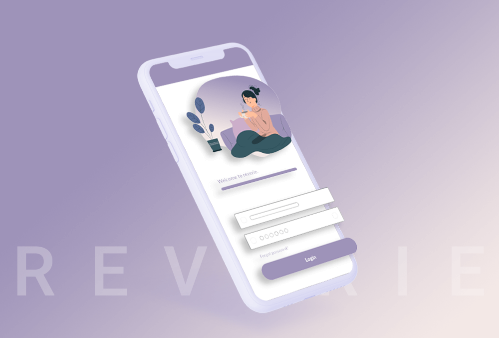
wherth is an app designed with the wage gap in mind. Women need a tool to leverage their current pay with what they deserve. They also need a safe place to ask questions and get resources. That’s what we hoped to solve with this app.
A disaggregated data plot would allow women to see not just the average salary in their industry, but also how they stand against men in similar roles.
With the aid of endless coffee and what felt like zero sleep, we came up with the prototype below!

UX Process
Don’t be such a rule follower
Fresh out of the General Assembly’s UX bootcamp, my teammates and I were set on following the steps we’d learned in class. It had to be sequential. It had to be seamless.
Of course, 10 hours into the challenge and we realized this was a highly impractical approach. We weren’t going to be able to do 10 interviews, a user flow, user journey, personas, low-fidelity wireframes, high-fidelity wireframes, AND the prototype. It just wasn’t going to happen in 70 hours. And it surely wasn’t going to happen in the perfect sequence. So we divided and conquered, sometimes doing things out of order but ultimately coming together to debrief what we’d learned to stay on the same page.
We cut out a lot of unnecessary bits but kept the same goal in mind: 20 screens, one prototype, but most importantly – the most relevant and succinct solution to the given problem.
UX Process
Be a systems follower
While there were some unexpected tradeoffs in the UX process, there were certainly some unexpected challenges when it came to designing systems. During this project, we got to collaborate in real-time using Adobe XD. Working remotely, we were able to work on the same file simultaneously which was very helpful given the scope and timing of the project.
Unfortunately, we didn’t establish a set of design systems from the get-go. This meant our grids, components, and workflows were a little wack-a-doodle. And this was a setback during the 9th hour.
Hall of Fame basketball coach John Wooden once said, “If you don’t have time to do it right, when will you have time to do it over?” And in this quote lies the essentialism of systems.
We had to make quick decisions and act even quicker. The lack of a solid foundation in systems made for an inefficient system. Moving forward, it’d be wise to work off of a strong design system.

Final Takeaways
UX can be messy.
As idyllic as UX can seem when people describe it as agile or lean, the UX process can actually be quite messy at times. There are areas when working on a team that you may not be aware of. There may be times when the gridlines just won’t cooperate with your desired design. It can be a challenge to realize that the real-world application is much more convoluted than two diamond shapes on a diagram might imply.
Surprisingly, our team The Blue Barracudas received an honorable mention for the app we designed. It was a really delightful shock to us all.
Some learnings:
+ group design challenges are awesome. They are a great way to flex some creative and collaborative muscles.
+ set your systems then stick to them. Establish the typography, components, grids, and systems early on and you will save yourself a lot of time in the long run.
+ flow is achieved when you are sandwiched between an airstream of difficulty and understanding. It’s the push and pull of this conflict that allows a person to stay engaged for hours. UX just happens to be one of those things for me.

More Projects